Saturday, 14 March 2015

Evaluation Question 5 Draft

5. How did you attract/address your audience?

I think that my front cover mainly attracted my target audience over my contents and double page spread because it expresses a lot about the magazine, it is informative and the model on the front is very glamorous and attractive. Due to having lots going on, and having lots of layers on top of each other, I was able to include more and more content with more use of my colour scheme. I feel this outlines my social group. My model has bright eyes and big hair, very glam, and the whole graphology of the cover is eye catching especially with the bold masthead in the ‘impact’ font at the top of the page. I think this is also my main attraction page for my magazine as it suits my audience profiles appropriately and works alongside their interests. This will be a contributing factor to my audience then wanting to purchase my media product and advertising it themselves to their friends and peers.

Front Page Mast Head:

The initial point of interest that is noticed straight away on my front page is the mast head. It is positioned in the centre at the top of my magazine in the largest size/font that could fit nicely (border left between masthead and edge of magazine). On other magazines like Bliss, Cosmopolitan or Dolly they have also used this technique of having their title at the top to engage their audience. On a magazine customers tend to read a page from the top down therefore placing the title at the top 1. It advertises my product and it’s branding and 2. It also makes the magazine more attractive and the layout neater. The font that I used is ‘Impact’ and this is what it says. It is bold and tall so therefore makes an impact when written in a large font size. I made my masthead black as this would further increase the attention of my magazine as the title wouldn’t blend in to the rest of the cover therefore gaining more customers. It would also be a lot more easily readable and harder to miss when on a shop shelf. Having this as a feature was inspired to me by the magazines previously mentioned as they have also used bold texts as their front page mastheads to engage the audience’s attention.
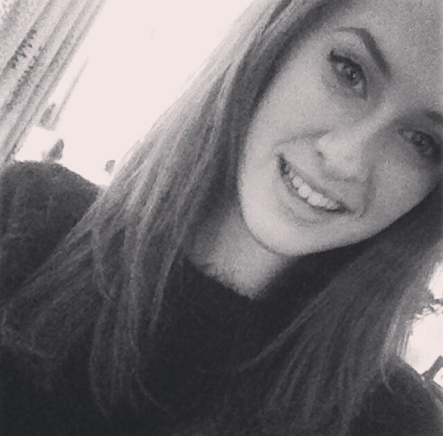
Main Model/Images:

The model that I have used as my girl wears similar types of clothing to what my target audience would where and be interested in. For example: the grey and black bodycon dress. This dress is similar to a dress you can buy from a high street shop called H&M therefore my target audience would have a similarity with my m0del. My artist/model is stood facing the camera looking straight down the lense. This draws my audience’s attention in as her eyes offer another feature of the cover to look at. Also her features make the image striking and more aesthetically pleasing to my magazines readers. This continues throughout my magazine as this same model is used and also my other models make contact with the audience through body language and through a powerful technique of photography. Having these pictures throughout my magazine is another part of why my magazine is going to attract the audience to buy it.

Cover Lines:

I have used lots of cover lines on my media product to ensure that my audience stay interested and there is enough for them to see. One cover line features my main artist ‘HUMAN’ of which I made a logo to make their band look slightly more official. I put this cover line in a coloured circle so that it stood out to the audience and it would be one of the first things that they see when looking at it. Having my feature of current artists and also ones that are upcoming is very important to my magazine as when analysing my audience research this is what they wanted from a magazine of this genre. It also gives my audience another reason to pick up my magazine if they see a name they don’t recognise because it could make them interested in them and therefore want to do further reading about them. A good example of having lots of different cover lines can be seen on the cover of Sugar magazine and also again, Bliss magazine. On the Bliss cover pages they have a lot of cover lines that are all different sizes but all a lot smaller than the mast head. The text is still all bold so it will still be attractive for the audience however being smaller ensures that the main attention will be on the image and masthead at the top of the cover. This convention has influenced my magazine as I have done something similar and ensured that all the text is still easy to read for my target audience.

Contents:

On my contents page I made sure that I have used the bands and solo artists that my audience will like so that their interest will be developed further for my magazine as a whole and not just on my cover page. Again, I kept my magazines contents page quite busy and full so that my audience know that there will be a lot of articles of their interest. Even though my contents page is so full I still made sure that it was neat and easy to read for my audience. This would be to ensure that my target audience know where to go to read the articles that gain their interest the most. I included 5 different images on my contents page; three small and two bigger. The three smaller images represent include ‘district line’, ‘HUMAN’ and also ‘Dan Collins’ who is a solo artist who also features on the cover. These images are to interest the audience on what else is on offer in my magazine and it makes it look more exciting rather than being a page with lists of numbers and text. The two other images are of ‘HUMAN’; on the left you have ‘Maddie’ (member of HUMAN) and also in the rectangular image above this you have both of the girls from HUMAN together. This will grasp the audience’s attention to the band due to the repetition of the girl’s faces. I included the image of ‘Maddie’ as I had used the other member of HUMAN on the cover page and felt this would make the audience more aware of who was in the band. To make this page look more effective, I used the same font as my cover masthead to write ‘contents’ at the top of the page. This makes my magazine more consistent rather than being confusing to my target audience so I am keeping some simple layout ideas in it. I have also used a box at the bottom and this is where all the text is. This keeps it separate to the images so locating what’s on what page will become easier. This will attract my audience as some of them will be quite young therefore could get bored of complicated layouts. Another reason why my contents page as a whole would suit and attract my audience is because there it has a lot of colour and this suits the general style and social group that my audience would fit into.

Double Page Spread:

I firstly had the band logo on the top left hand side of the double page spread; this reassured the audience about what they were about to read about. The page was covered in images and colour and this would be the initial attraction to the page. I made sure that the images I used were fun and relatable to my audience. The poses that were done weren’t too serious and this means that the young female readers could try it themselves and this could also have an impact on their interest to the magazine and artist on the double page spread. Another way that I attracted my audience was by using the line ‘IN THE HEART’; this attracted my audience as I am aware from the profiles on my target audience and also my fan girl research that they are interested in this type of text. I have included this type of language in my articles also so that my audience will find it interesting to read and also so that would engage with the interests that they have. I chose to layer the different bright colours on top of each other (including text colour) so it all stood out and was eye catching to the audience. I put in bubbles some small pieces of text and this means that the audience will be getting a small in site to what the articles will be about. This further means it will interest the audience in small steps. What I mean by this is that they will read the small pieces of writing and then their interest in the band/artist or topic will develop making them more interested in the longer articles. Another included layer that I have on my double page spread includes the central images at the top in the centre of the page; both of the images are mid shots of both members of HUMAN and it shows them styled in black clothing and with ‘perfect’ hair and makeup. I feel this would gain my audiences interest and attention as they could look up to these models and the models are wearing clothes related to the audience’s styles. On top of this I also photographed HUMAN more naturally when they were laughing at the camera and posing together. This again draws my audience in through the eye catching images and a feeling as if the models are laughing with the audience at the articles.

Evaluation Question 6 Draft

6. What have you learnt about technologies from the process of constructing this product?

Camera:

For the photography of my media product I used a Nikon D3200 camera. When using this camera to take images for the draft magazine pages, what I found was that it took some very high quality images and this led me to using this same camera for my final images. This ensured that my pictures on the pages of my magazine looked natural and also to a high professional standard. This will help to gain customers and also to fit into the distribution process of high quality magazines more easily. To take my images I used surround lighting to make sure my artists had plenty of light on them to prevent shadows and to make the artists look much clearer when they could be seen on bigger screens. Finally the background for my images was simply a white back drop and this make it easier to cut out my pictures and put them onto different backgrounds and it also enhanced the colours and look of the artist in the photo.

Photoshop:

I used the Photoshop software on the school computers to create my media magazine/product as I felt it was the best and most suitable software to use. I learnt how to edit and manipulate images to fit my needs and also so that my target audience would like them. An example of an editing technique that I used includes the cutting out some areas of my images using the lasso tool. Something I did with this tool was removing some of the backgrounds of my images. My whole magazine was done using Photoshop CS6 and this includes all the layers on the pages. Before I started to make my magazine, I had little knowledge about the Photoshop software but after completing some practical tasks I can now say I have a better understanding of the software and what to do with it. This is clear when comparing my first design for my cover to my final magazine. The tools I have used have improved and become more advanced.

Online sites and programs: 

For my magazine I also used a variety of different online programs and resources to put together research to make sure my magazine and its production was right for my target audience. To create my overall coursework blog I used blogger and this allowed me to post updates about what I had been researching using and producing all the time. It was almost like a diary of my work, that I could keep looking back on to develop ideas further for my magazine. I also used many websites like Google as a search engine, da font (to download fonts for my pages, and also UK tribes to get research about my social group and target audience.  Following this I used Microsoft Word to write out the text I was to put on my blog, whether its research or general text it made me able to ensure that the spellings were correct and also so I could see the amount of words I was writing.

Evaluation Question 7 Draft


7. Looking back at your preliminary task, what do you feel you have learnt in the progression from it to the full product? Mise en scene and camera work:


When looking back at the preliminary work that I did, I can see that I have made a lot of improvement in the way I can produce a product and also the outcome and result of my product is a lot better. In terms of camera shots and the mise en scene in my photos the quality is at an equalling high standard however I feel the choice of photos that I changed ended in being a much better selection of images for my media magazine. I also took some more pictures for my magazine of males rather just sticking to females and I felt this improved my magazine also. What this showed is that I have made an improvement with matching the style of my artists and my genre of my magazine and then also my target audience. This would help me gain more interest from my target audience. An example would be that on the front cover of my preliminary work the mise en scene of my model looks quite basic as my model is just wearing a sports top. This would therefore only connect with one audience whereas if he was wearing a more basic piece of clothing that didn’t address anyone, the audience range would have been better potentially. On the other hand the front cover of my final magazine/product ‘CONFIDE’ has a model that is styled in a plain grey and black dress with big hair and pristine makeup. This would reach the whole of my audience within the magazine as it is simple yet effective and relates to the style of my target audience and this would then help gain more customers for my product. This change of styling outlines the improvements that I have made when taking the images for my magazine in the factor of the mise en scene.


On top of this, my camera skills have also made an improvement since producing my preliminary work to producing my final magazine and this is due to the development I have made from analysing my first images, noticing a fault and then changing my technique. What I found in my preliminary images was that there was quite a bit of shadow behind my model due to the artificial light and this meant that I have to edit it out in Photoshop using the lasso tool. To improve this, for my final images, I moved the artificial lighting to different places and angles so that the shadowing was at its minimum. Another part of my camera work, would be the directing. I have learnt new directing skills while taking my photographs for example; in my preliminary cover tasks I give my model a very basic pose and it doesn’t look very natural too my model. On top of this, I gave little input as I had lack of knowledge of different styles of poses. For my final product images I was able to direct my models much more easily as I had completed research into different photo-shoot’s and poses. For this I simply found images off the search engine Google and analysed them in note form. This meant that when it came to directing my models, I was much more comfortable as I had more knowledge of what to do. For my final shoot, I directed my main model to look directly down the camera and made sure that her hair was the correct shape. This added effect to the image as it looked a lot more glamorous and would be eye catching for my audience. Overall this outlines more improvements which I have personally made while producing my final product since my preliminary product.

Friday, 13 March 2015

Paper Types

Type
Description
End-USE
Cast coated paper
Provides the highest gloss surface of all coated papers and boards
Labels, covers, cartons and card
Calendared or glossy paper
Paper that has gone through a glazing process – can be both coated and uncoated
Colour printing
Machine finished paper
Paper which has been finished on the papermaking machine and is smooth on both sides
Booklets and brochures
Lightweight coated
A thin, coated paper, which can be as light as 40 g/m2.
Magazines, brochures and catalogues
Matte finished paper
The relative roughness of the paper surface prevents light from being reflected. Can be both coated and uncoated
It is used in all kinds of high quality print work and is suitable for colour printing
Machine coated
Paper that has the coating applied whilst it is still on the paper machine
All types of coloured print
Silk or silk matte finished papers
Like matt finished coated paper the surface is smooth but without reflections, which means that it combines high readability with high image quality
Product Booklets and Brochures

Magazine Covers

Here are a few examples of magazine covers that helped influence me into using a brighter colour scheme.

The use of the colour pink on this magazine cover will stand out to the audience. As well as this it also looks good layering on top of the models pink dress.


This ELLE magazine cover has used the colour and pattern from the models outfit in the title. The use of yellow adds something different to this cover. 


This cover page is full of bright colours that engage the audience into different areas of the magazine. I especially like the use of the pink that has been used for the title and also the surrounding shapes and some of the text. You can clearly see that this colour scheme is similar to mine of blue, pink and black. 

Thursday, 12 March 2015

Models Included In Magazine

Main Models
 
Charlotte Dickinson

Eleanor Guiver


The reason why i decided to use the two girls above as my models for my magazine as to begin with i feel that they are both glamorous and look like pop stars. I also feel that they look fairly similar so would go well together as a duo. On top of this i feel that for styling i can do what i like as they would both suit any type of clothing. Overall i am glad about my choice for my main models for my band/double page spread.


Extras If Needed
Dan Collins (image of Dan is on the contents page on right)


Redmond Harrison (image of Redmond very small in top right hand corner of contents page, in group image with Melissa, Jack and Amy).


Melissa Nutt (Me) (image of Melissa very small in top right hand corner of contents page, in group image with Redmond, Jack and Amy).


Amy Fowles (image of Amy very small in top right hand corner of contents page, in group image with Melissa, Jack and Redmond).


Cam Letts (potential use on contents page)


(A picture of Jack has not been included due to none being available).

Audience Prediction

Who do I want to read my magazine?

If my magazine was to be published I would want the audience to be what I originally categorised for the age. In terms of personality and things I think that the typical female to read my magazine would be a bit of fan girl who liked boy bands and quite common music like the music that you would hear on the radio (Capital FM). As my magazine is published monthly, I would expect my typical target market girl to be excited about the next issue and have quite a quirky personality.


My magazine could be read by anyone however I have specified that my magazine is for young girls. This is because I feel young girls read a lot of magazine and especially ones about their favourite musical artists. The magazine itself is however in some ways quite mature so would therefore be suitable for older girls around 17, 18 so they had a choice to read it or not. On the other hand I do feel my magazine would appeal more to the 13, 14, 15 year old girls area of the market. 

Some examples of the typical girls who might read my magazine could be people like Lily, Tee and Carmen from the CBBC television programme Tracey Beaker Returns. These girls and are very private but when they have a passion for something they really get into it. They all read a lot of magazines and dance to the radio when it comes on. Overall i feel that these girls are good examples of my typical target audience. The image on the right is of the character 'Tee' and as you can see she is very colourful. In terms of instant 'judgement' this would be how i predict my target audience to look.